
TBA works in the web browser on your phone. When you open it on a phone, pages automatically switch to a layout built for a small, touch screen — the same pages, the same data, and the same permissions as on a computer. There is nothing to install. (A downloadable phone app is planned but is not available yet.)
How the Phone Layout Works #
The phone layout turns on by itself when your screen is narrow. Computers and tablets keep the regular layout.
- Menu button (three lines, top left) — opens the main navigation (Clients, Sales/Service, Items, and so on) as a drawer. Tap a section to open it, then tap the page you want. The drawer closes when you pick a page.
- Actions button (three dots, top right) — opens the page’s sidebar: the same Add, Find, List, Send, View, and action buttons you see down the left side on a computer. Tap a group such as Send or View to expand it. It closes when you choose something.
- Tap outside a drawer, or use its close button, to dismiss it.
What Looks Different #
- Forms stack in a single column, with each label above its field and large touch-friendly controls. Icons such as the folder-with-plus for extra phone numbers or addresses sit beside their label. See Client Details for an example.
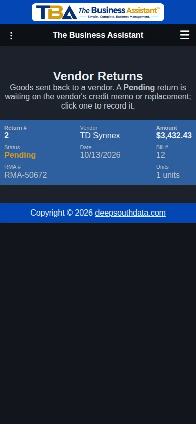
- Lists become cards. Each row of a list, such as Invoices, Quotes, Sales/Service Orders (SO#, client, and total on the first line), or Vendor Returns, shows as a small card with labeled values instead of a table with columns. Tap a card to open it. Paging works as usual.
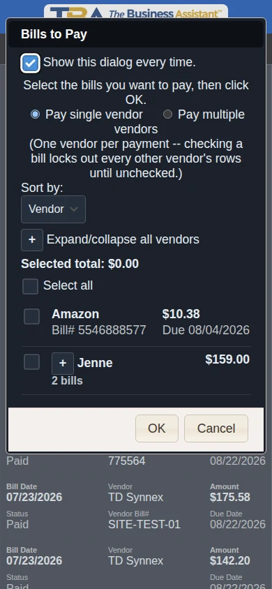
- Check-list dialogs — the lists that open on their own to help you act on many items at once: Items to Invoice (Invoices), Bills to Pay (Bill Payments), and Items to Order (Purchase Orders). Each row is a card with a larger checkbox on the left; the Select all box sits above the list. Where items are grouped by client or vendor, the summary card shows the name, the count, and the combined total, and a larger +/− box shows or hides the lines under it. The sort control, the Selected total, and the expand/collapse-all box wrap onto their own lines. Long lists scroll inside the dialog while OK and Cancel stay visible.
- Tabs (the Client, Quotes, Orders, Invoices… row inside Client View) wrap onto two or three rows of buttons.
- Line items on quotes, orders, invoices, purchase orders, and bills show as one card per line rather than a wide grid. Description, quantity, price, and tax appear in a readable stack, and each line can still be collapsed to a single row. Totals appear below the lines, and the Save button follows them. On a bill, a returned line’s return note appears in its card.
- Dropdowns open as a list that slides up from the bottom of the screen. The current choice is checked, long lists open scrolled to it, and long choices wrap instead of being cut off. Tap a choice to select it. (A few lists, such as multi-select boxes, keep your phone’s own picker.)
- Dialogs (the pop-up windows for addresses, contacts, communications, unit details, returns, and so on) fit the screen with the labels above the fields.
- Dragging works by touch. Where you reorder things by dragging, such as the In/Out Board or the tiles under Configure This Page, press and drag with your finger.
- Calendars are simplified. On My Tasks, the month view is a compact grid with task counts (tap a day to open it) and the week view is one card per day. On the Time Tracking Calendar, each week is a list of day rows with tappable hour chips and a week-total row.
- Reports keep their wide result grids, which scroll sideways. Their filter bars wrap so every option is reachable. See Reports Overview.
Pages That Stay Desktop-Only #
A few pages are too large or detailed for a phone and always show their regular layout. They still open, but you will scroll and zoom to use them:
- Report Designer — a drag-and-drop page designer.
- QuickBooks Import — a one-time data migration.
- Bank Import and Reconciliation — matching long lists of transactions.
- The permission profile grid in Users and Permissions — nine checkbox columns per section.
The Timeclock Kiosk has its own screen designed for phones and tablets.
Switching Back to the Desktop Layout #
If you prefer the full desktop page, or need a feature that is hard to use on a small screen, open the Utility Menu and tap Use desktop layout. The page reloads in the regular layout, and this choice is remembered on that phone. Tap Use mobile layout in the same place to return. The button only appears on a phone or in a narrow window, and only on pages that have a phone layout.
Tips #
- Everything you can do on a computer, you can do on a phone as long as the page isn’t one of the desktop-only ones above. Use Global Find to jump straight to a client, invoice, or item without navigating.
- Turn your phone sideways when you need more room for a wide report or list.
- Save to the home screen. In your phone’s browser menu, choose “Add to Home screen” for a one-tap shortcut to TBA.
- Page looks stale or not updated? Your phone’s browser may be holding old files from before an update. Close the browser completely and reopen it, clear the site’s data, or restart the phone. If that doesn’t help, tell your administrator.
- Staying signed in. TBA signs you out after a period of inactivity, set per user; see Users and Permissions. Two-factor codes can come by email, so having your email on the same phone is handy.
- Camera and photos. The Add photo button in Attachments and Pictures works with your phone’s own file chooser, which usually offers the camera as well as your photo library.
Is Something Missing or Hard to Use? #
The phone layout is still growing. If you find a page that scrolls sideways when it shouldn’t, has overlapping text, or is awkward to use, tell your administrator or TBA support along with the page name and your phone model, and use Use desktop layout in the meantime.


